Lincoln Avenue: Color Breakdown
There are not as many things as high-impact and cost-effective as paint!
We recently finished a 1-year renovation project on Lincoln Avenue. We've had hundreds of people through multiple cocktail parties and open houses. And the one question we got the most was: "What colors did you use?" So I thought I'd dedicate a blog to it.
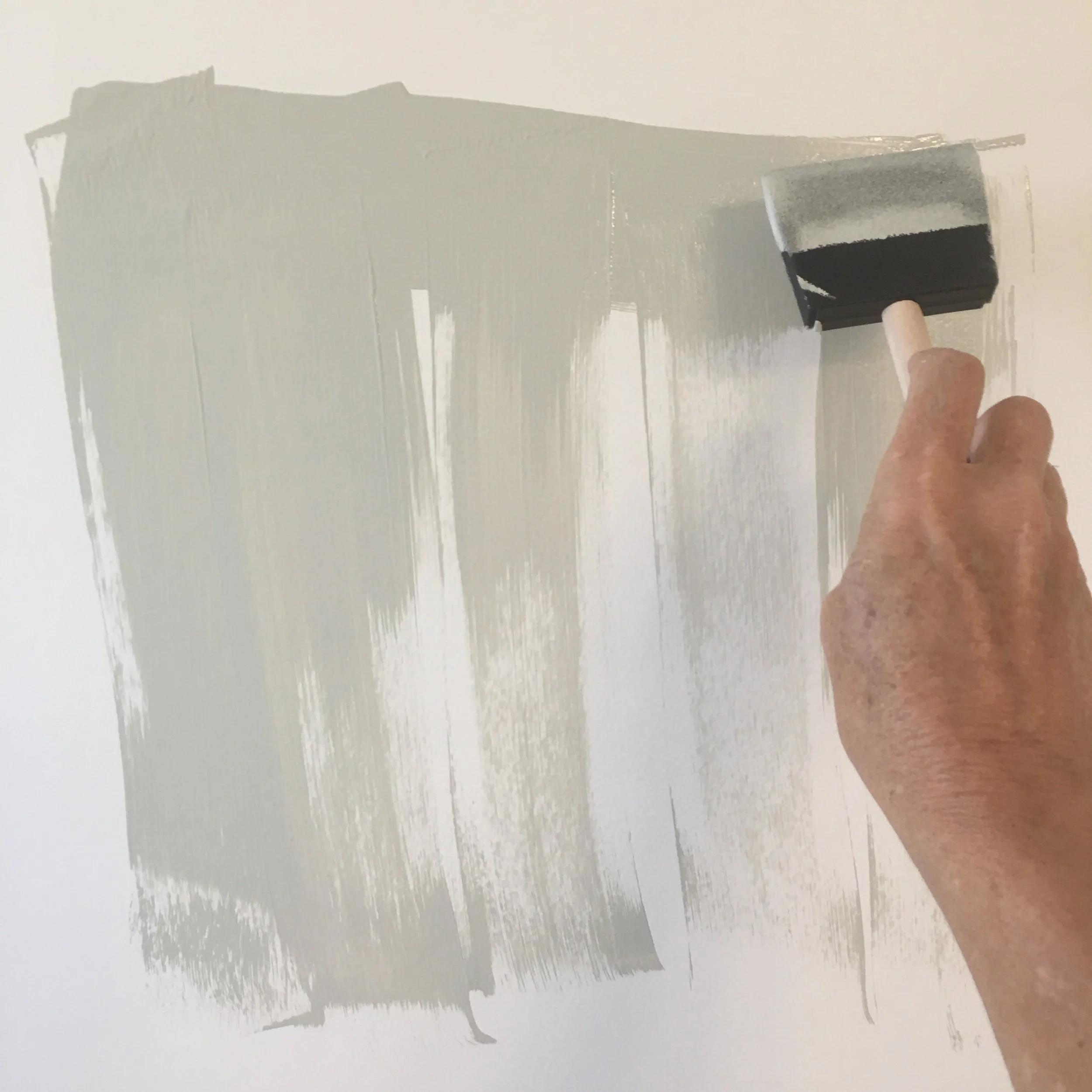
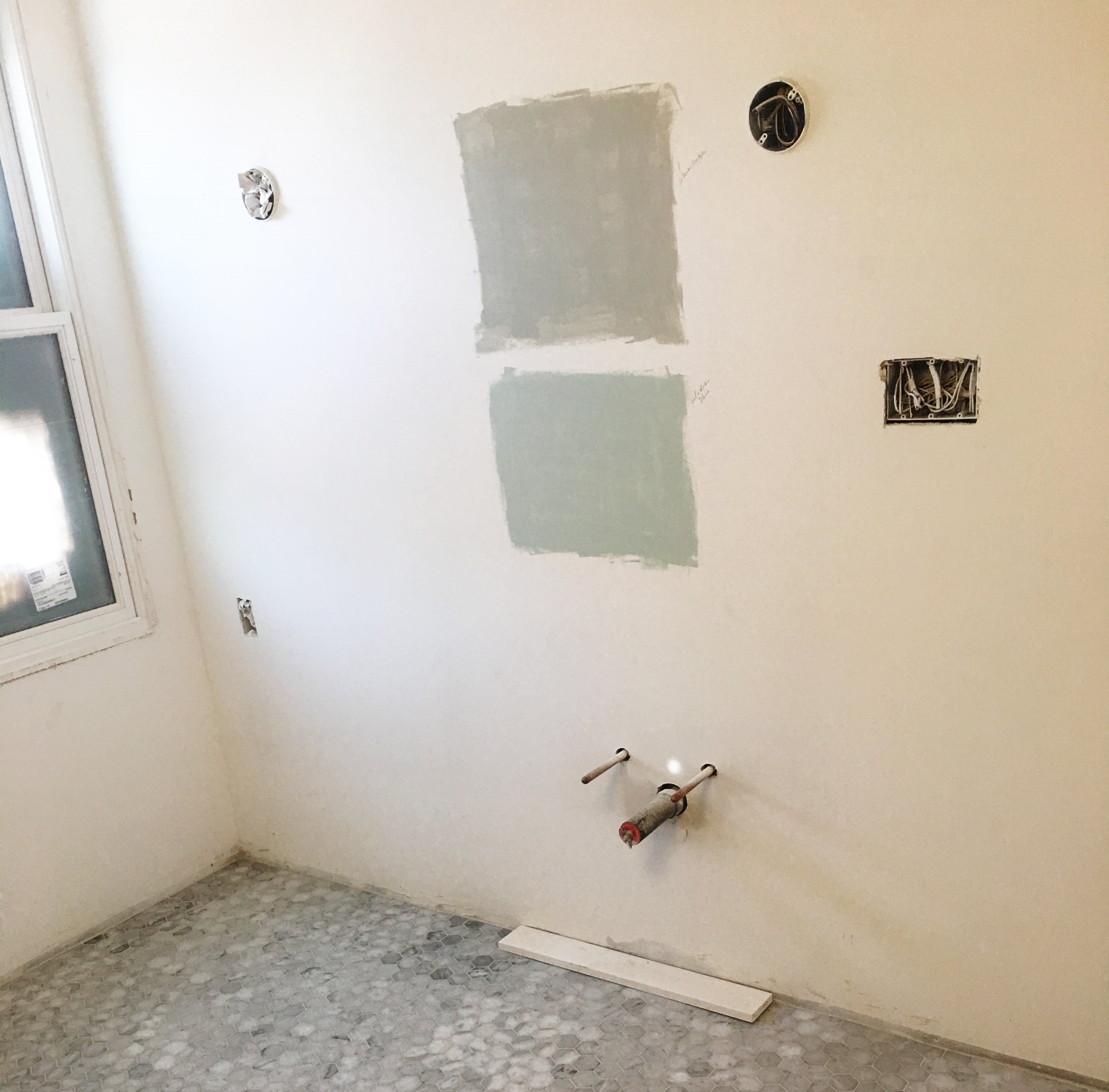
I've learned a lot about paint throughout our last 3 renovation projects. And, here's the first thing I learned: Don't trust swatches from the paint store alone. It really helps to paint a swatch on the wall. A fairly large swatch, And look at it throughout the day, as the light changes.
I also realized that we all really need a great neighborhood paint store. Just like we need a good neighborhood coffee store, grocery store, etc.
Even though most of my color choices come from Benjamin Moore. Guess where I buy my paint from? My neighborhood Sherwin WIlliams store. The manager, Amador, is lovely. And the area sales guy, Joseph, is bright, happy and delivers good, old-fashioned customer service. He's even come onto the job site when I've had painting issues (polyurethane over wood on vintage vanities). He has pizza parties at his store. Plus, they actually deliver (which comes in handy with those heavy 15-gallon cans!). Last plug: They don't even care that the swatch comes from Benjamin Moore. So, there you have it!
Okay, let's start with the exterior
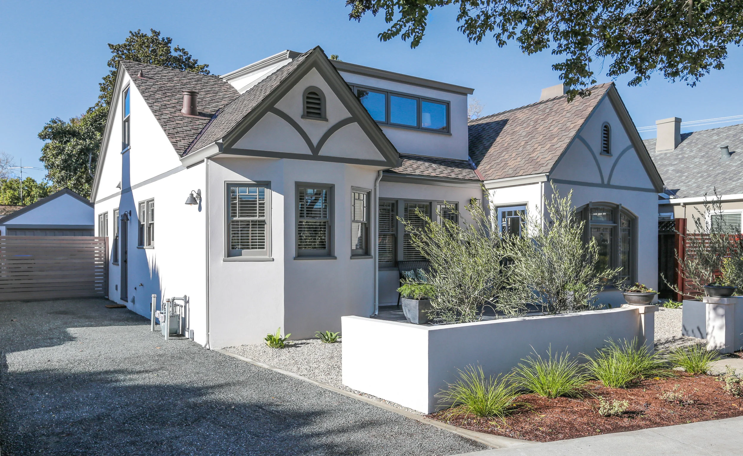
House exterior: BM Bruton White, Trim: BM Chelsea Gray
I can't take credit for this handsome color scheme. I have to give a shout out to my talented friend, Jody White. She used these colors on her house and I harassed her until she shared them with me. Thank you, Jody!
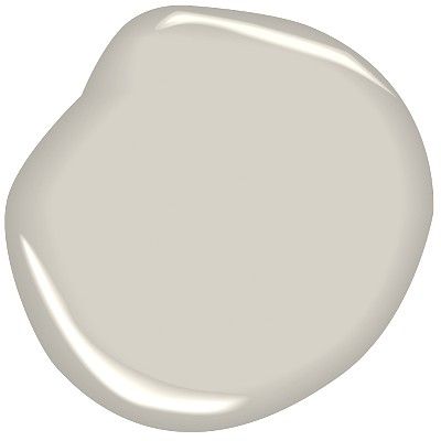
There are a shockingly large amount of options when it comes to white. This white almost looks gray on the chip. It has a coolness and brightness to it. Without being too cool or too bright : )
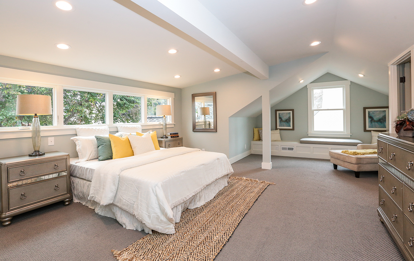
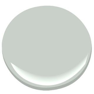
The class favorite: BM Quiet Moments
It never fails that someone walks into one of these rooms and says "what's this color?"
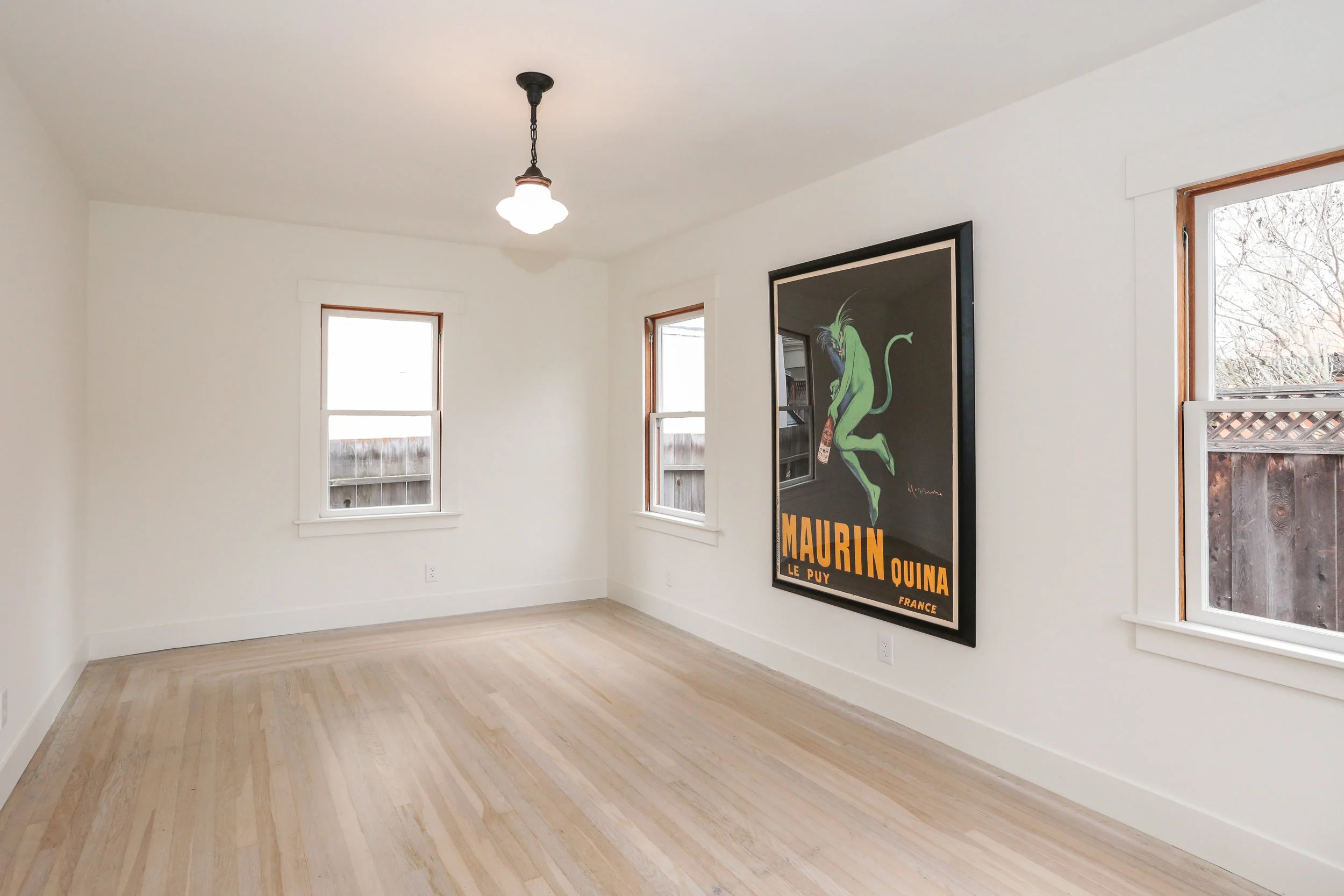
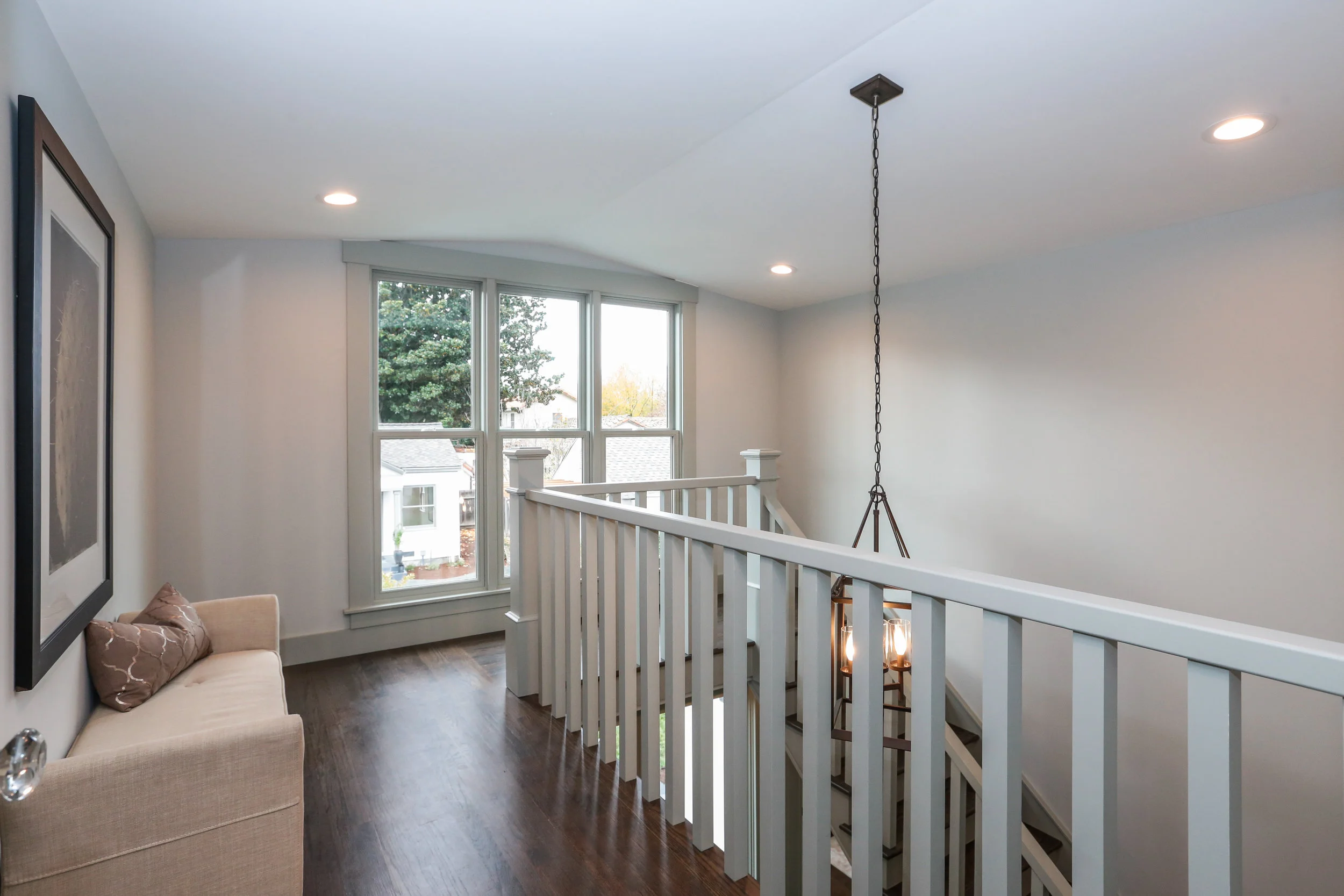
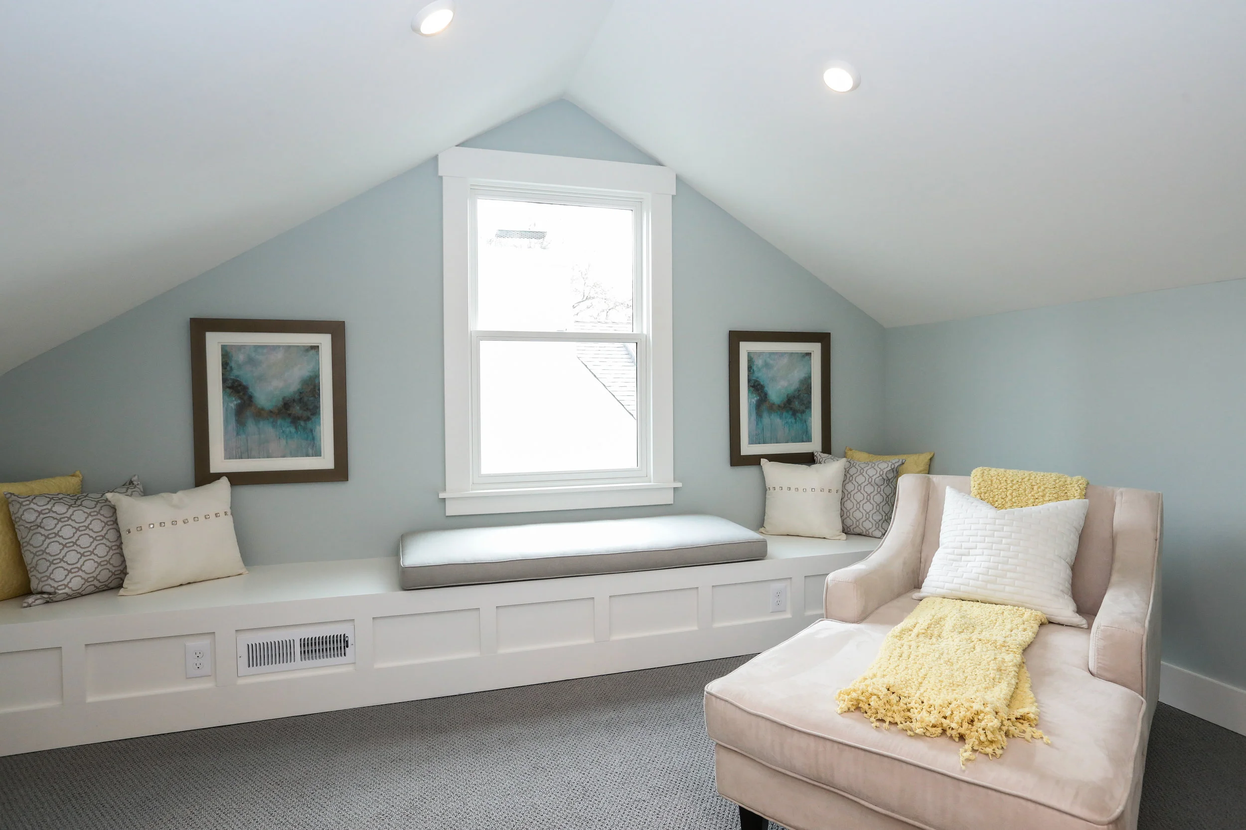
Believe it or not, BOTH of these rooms were painted with Benjamin Moore Quiet Moments. Although the master looks way more neutral a bit more green. This color is incredible. It changes with the day but remains peaceful and calm.
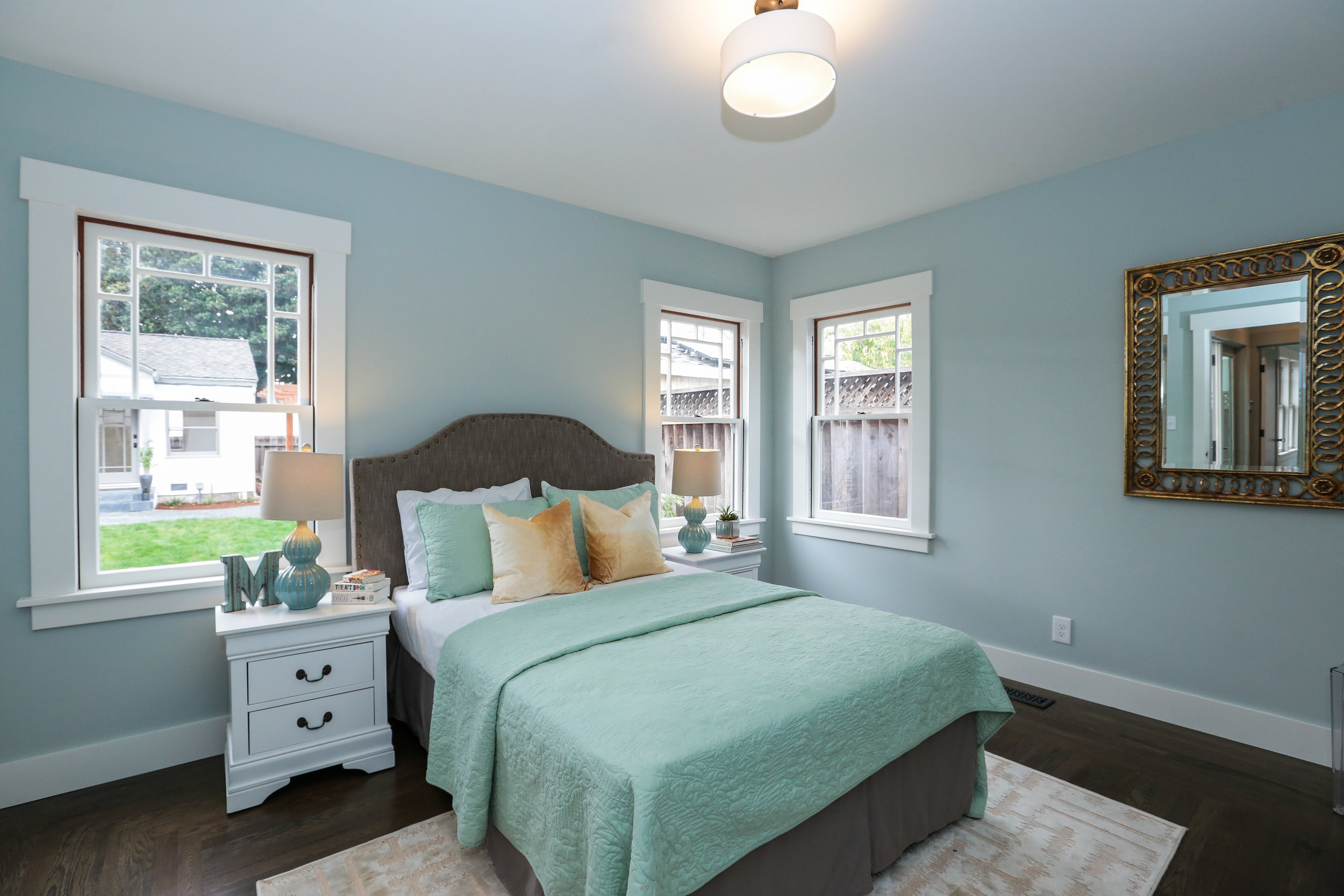
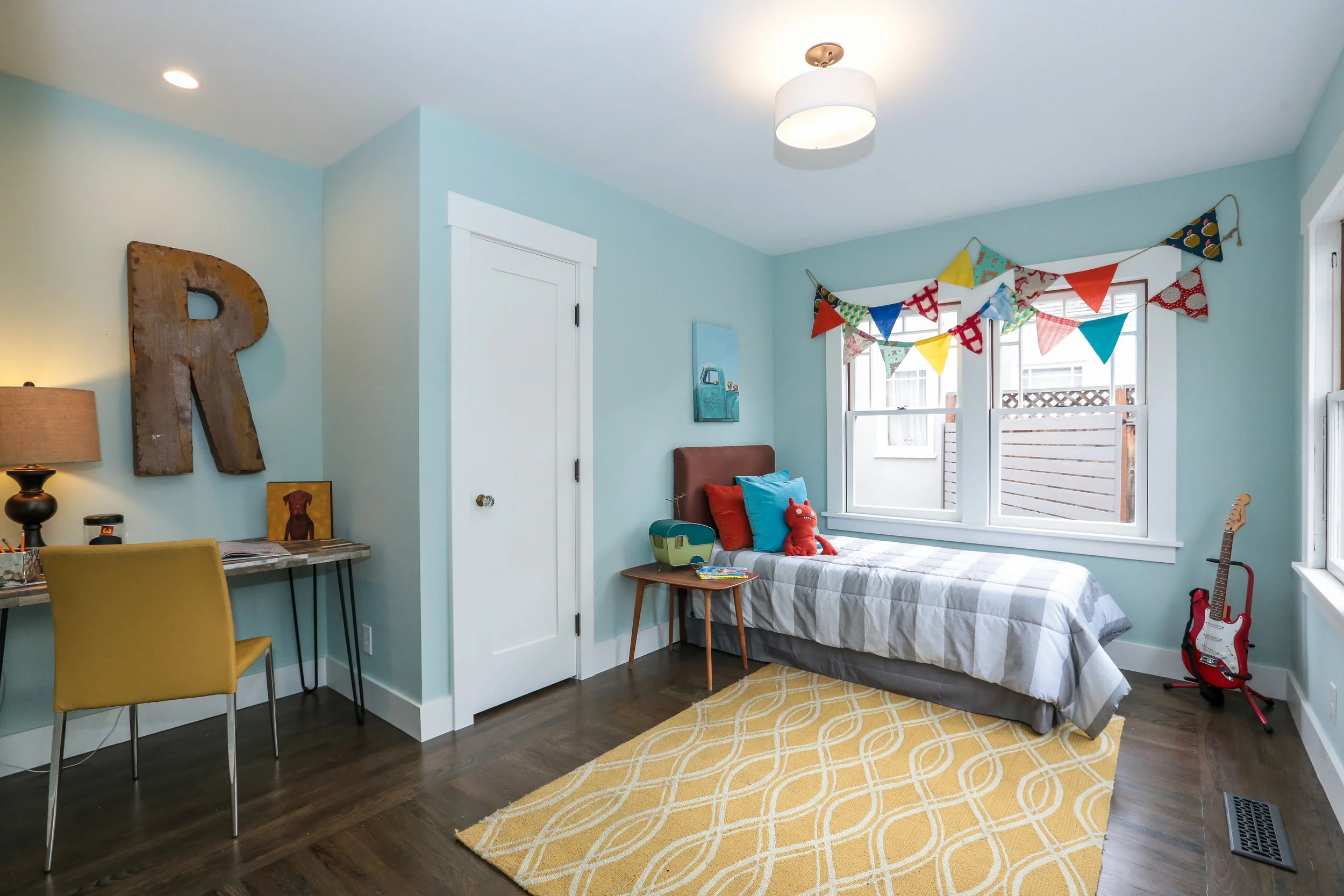
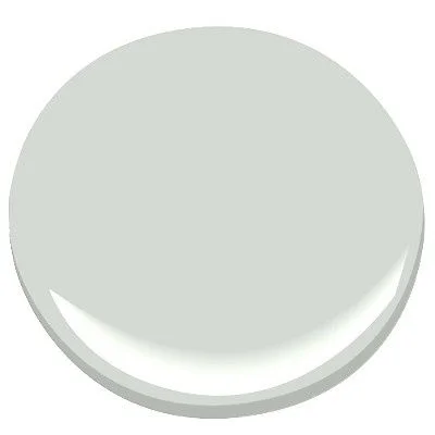
Palladian Blue
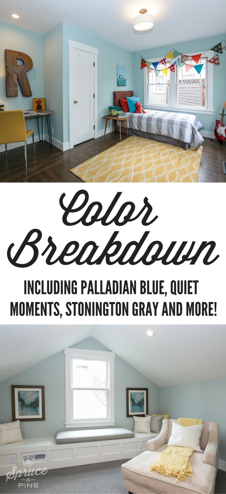
We chose Palladian Blue for the staged kid room. It was bright and happy but had a slight sophistication to it. As you can see, the photo of the room looks different than the chip. All of these green/gray/blues have this issue. Another reason you need to paint a big swatch on the wall and see if you like. I will warn you that this painted swatch looked a bit too bright. Lance was wary of it but liked it in the end.
If you search for Palladian blue, you see (and learn from) a lot of folks on Pinterest comparing these similar paint colors. It's worth looking. If you start digging, you'll see (and learn from) lots of folks on Pinterest comparing similar paint colors.
PALLADIAN BLUE VS. QUIET MOMENTS
This source compared BM Palladian Blue (bottom swatch) to BM Quiet Moments. My experience was that Palladian Blue was a much stronger color, but you can see what she has to say.
PALLADIAN BLUE VS. QUIET MOMENTS
This blogger compares Palladian Blue to Sea Salt. Take a look at her learnings.
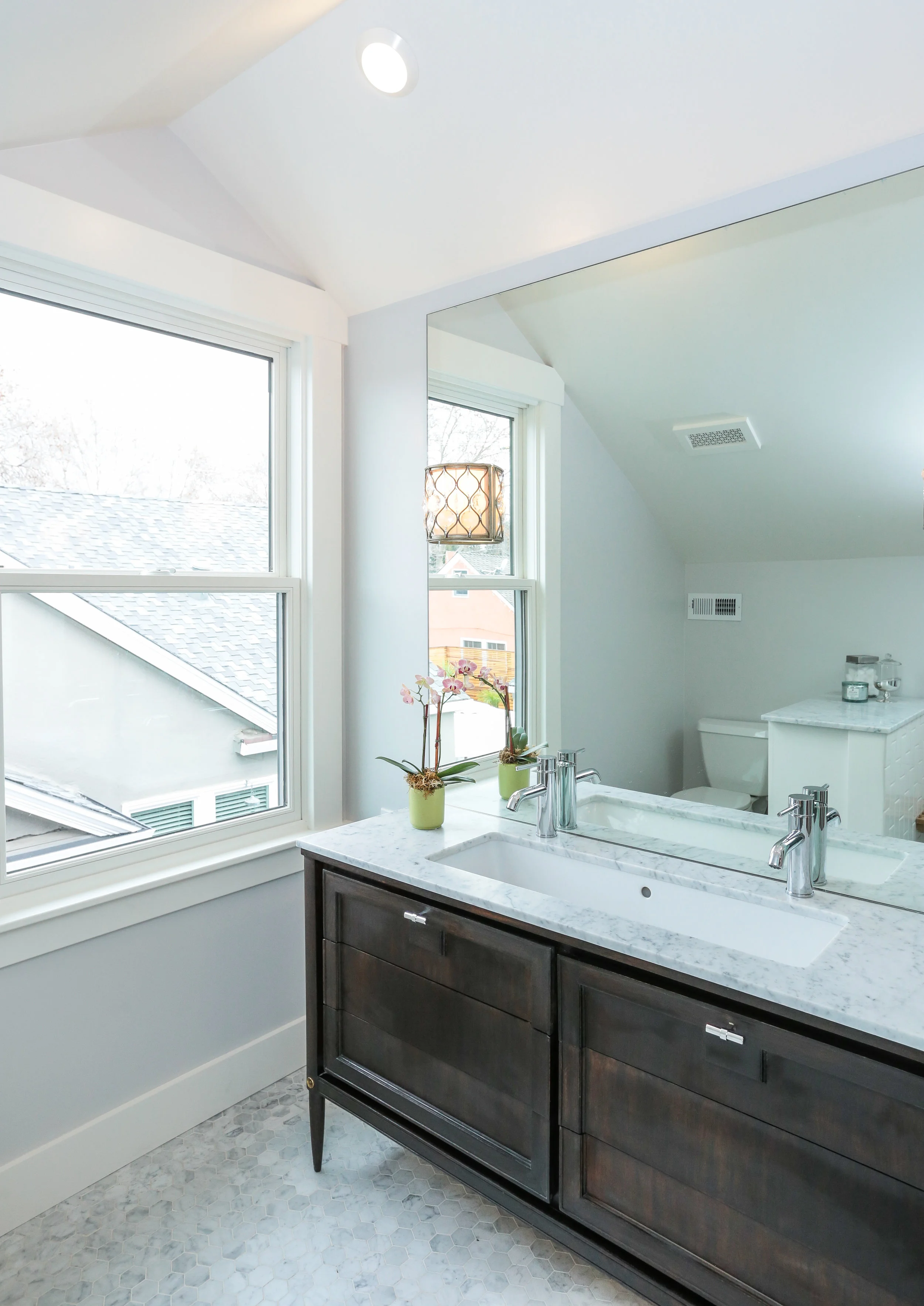
Master Bathroom: Wickham Gray
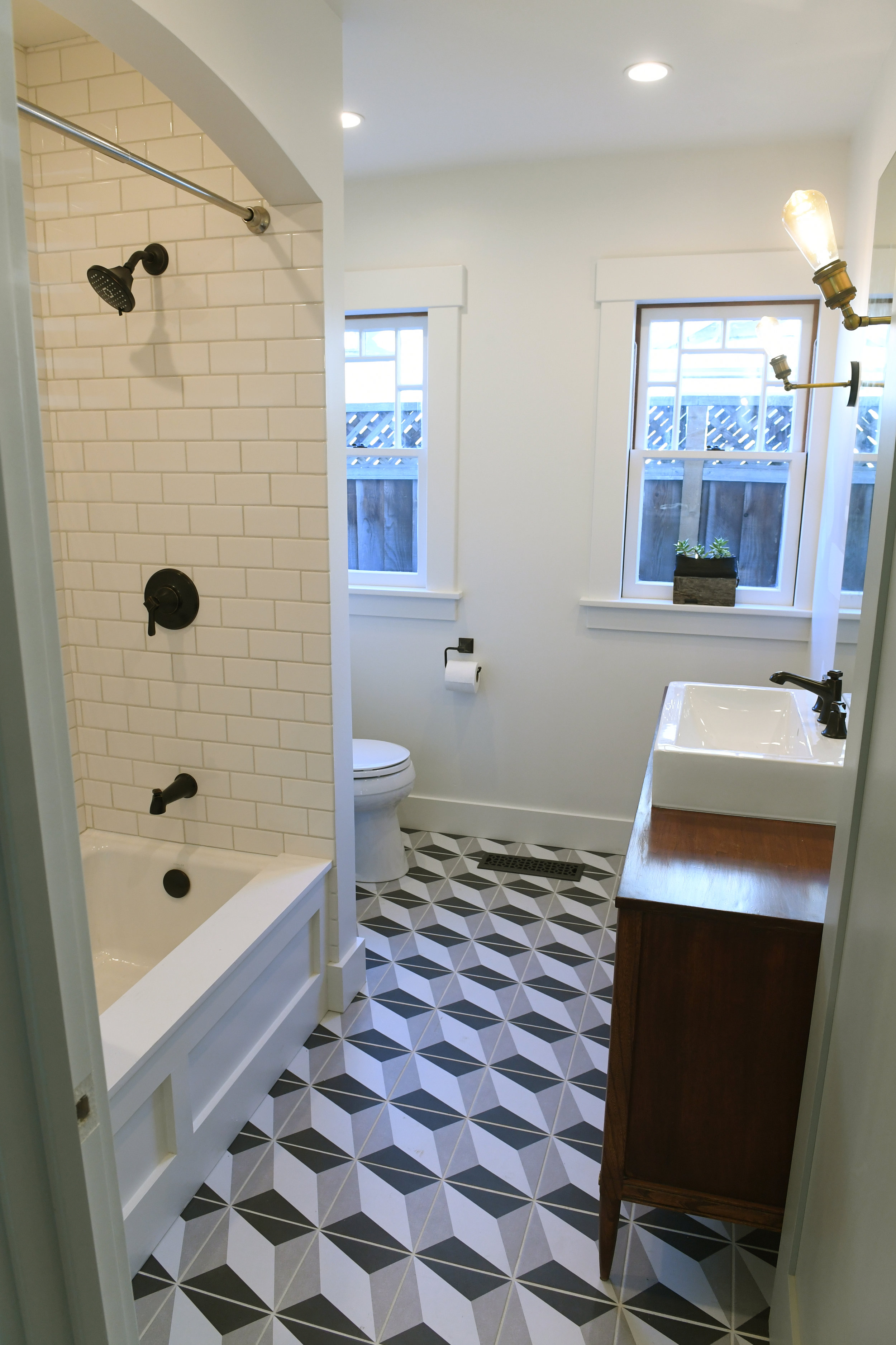
We wanted something neutral and even considered bringing the Quiet Moments into the bathroom but it was a bit too green for the Carrera Marble hexagon floor tiles. So we ended up going with the next favorite, Wickham Gray. It's slightly cooler towards the bluer tones so it pairs beautifully.
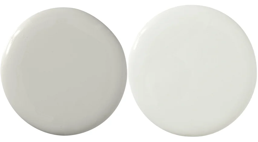
Wickham Gray walls. Dove White trim.
Here's a great shot of Wickham gray and how seamlessly it pairs with Carrera marble!
Monochromatic Gray
I'm going to just touch on this now because I've dedicated an entire blog to my obsession in finding the perfect monochromatic shades for Lincoln. Stay tuned.
This was the color combination I was after and, Dog-Gonnet, it took a long time to figure it out. After many, many runs to the paint store, I just finally couldn't take it anymore and made a decision. I couldn't be happier with the outcome. In fact, I'm slightly obsessed.
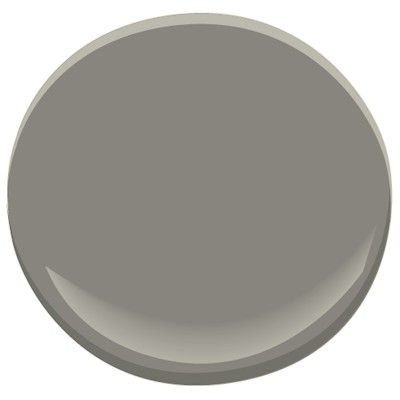
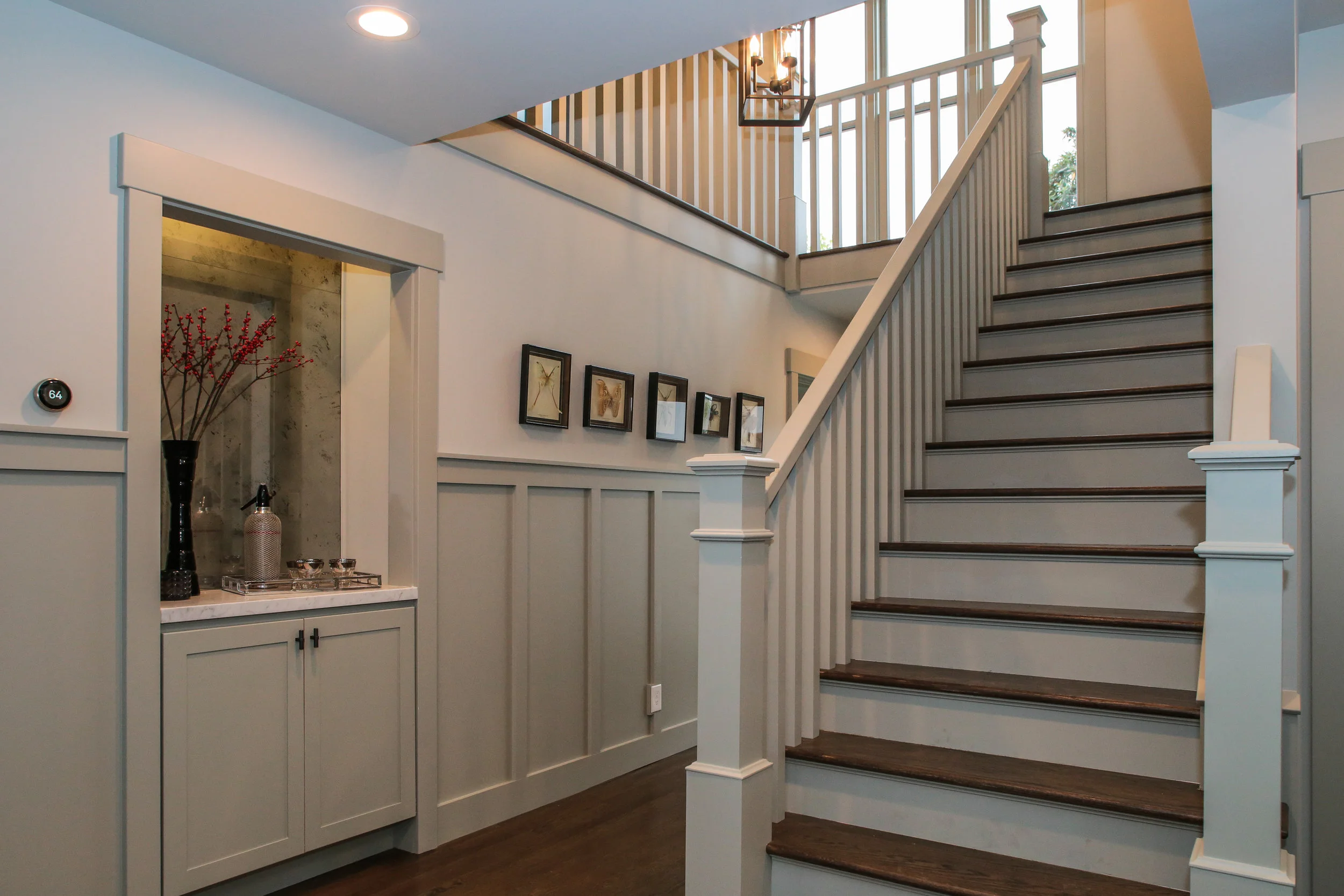
Walls: Sherwin Williams Aloof Gray, Wainscoting: BM Stonington Gray
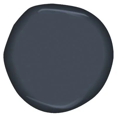
Hail, Hale Navy
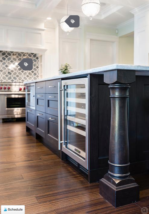
I discovered BM Hale Navy when I found this photo (below) and decided to use it as reference (aka: copy it) for the Lincoln kitchen island.
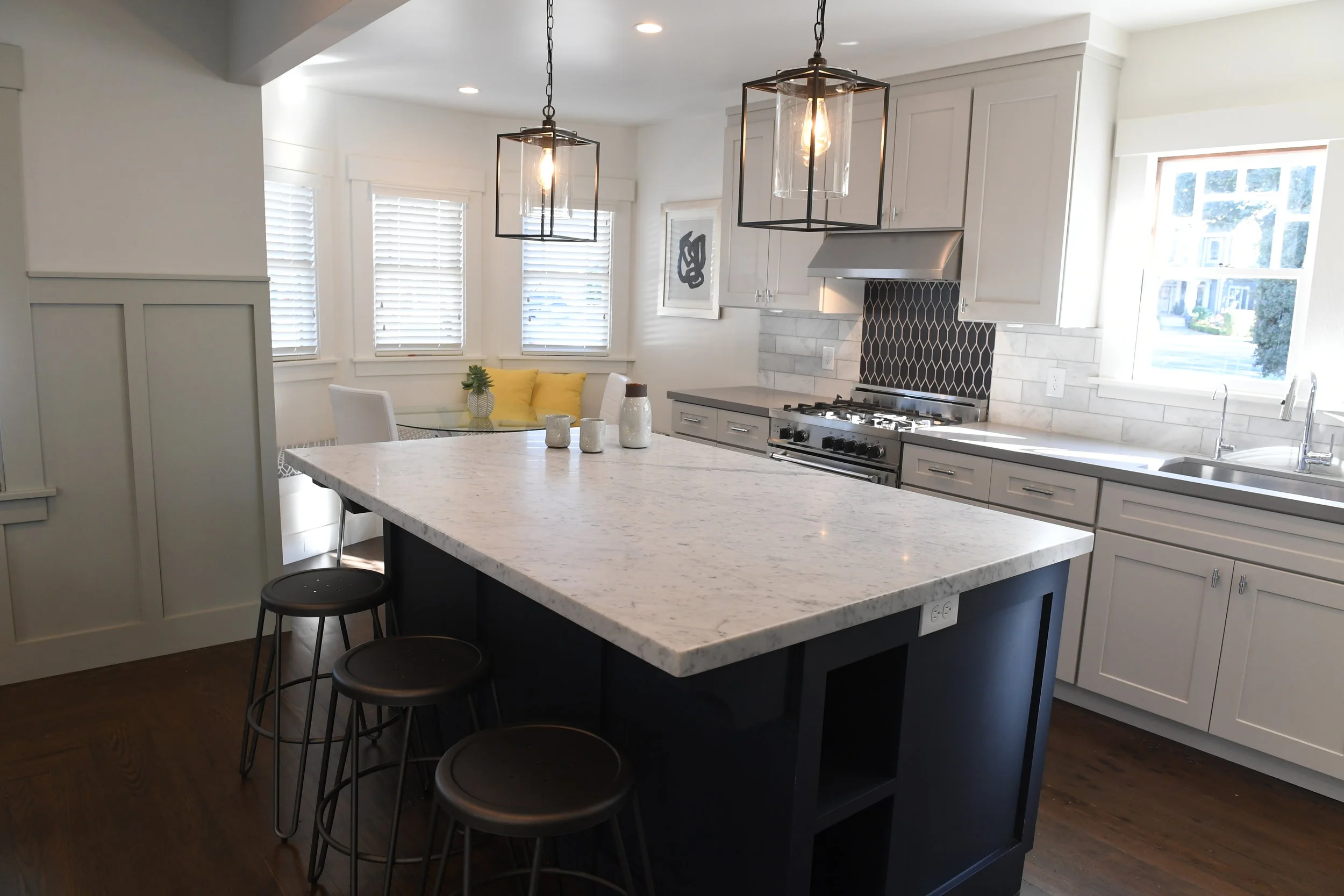
Here's a shot of the kitchen at Lincoln. I know, nothing like the reference but I did my best. And on the back splash had to substitute Ann Sacks tile for Heath Tile, which is equally amazing but the seconds room is more in our price range!
Island: BM Hale Navy, Kitchen walls: Dove White.
Lastly, my go-to white: Dove White
I discovered Benjamin Moore Dove White during our first renovation project. As you know, there are a million whites. I don't like super bright white nor do I like warm whites.
What I do like is an Oyster white which seems to have a teeny tiny bit of green and a little gray. I use it everywhere. In this project, the entire cottage was done in Dove White, with different sheens.
Ceiling: White Dove (flat), Walls: White Dove (satin)
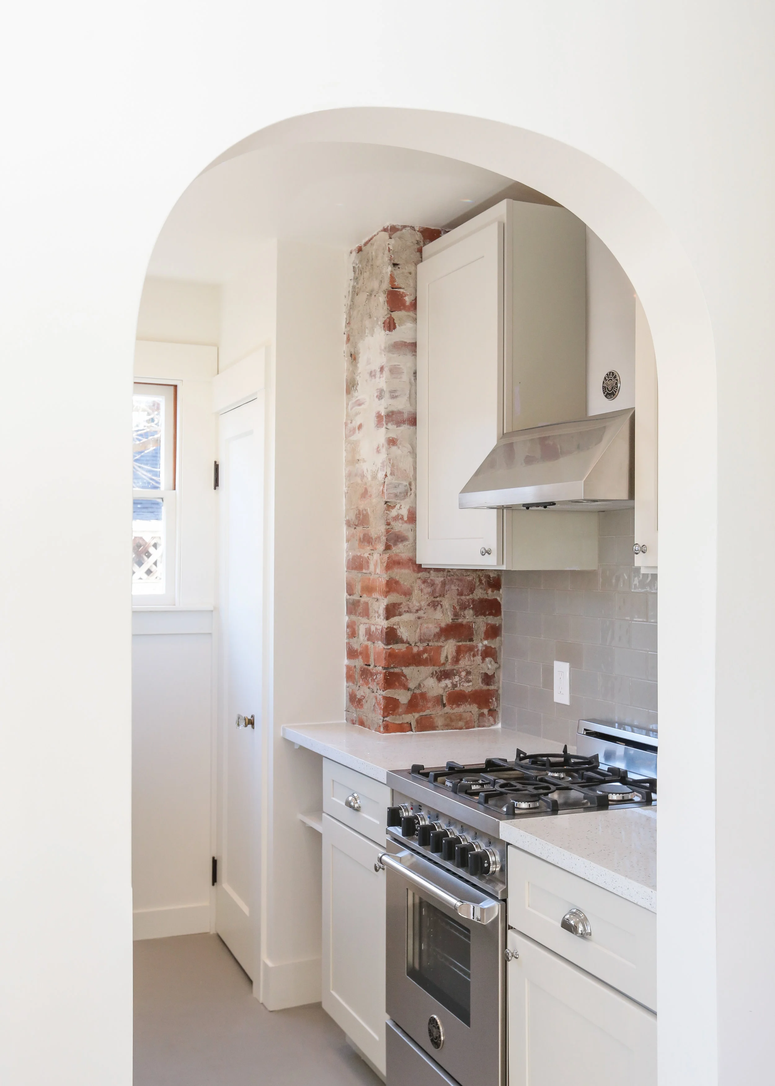
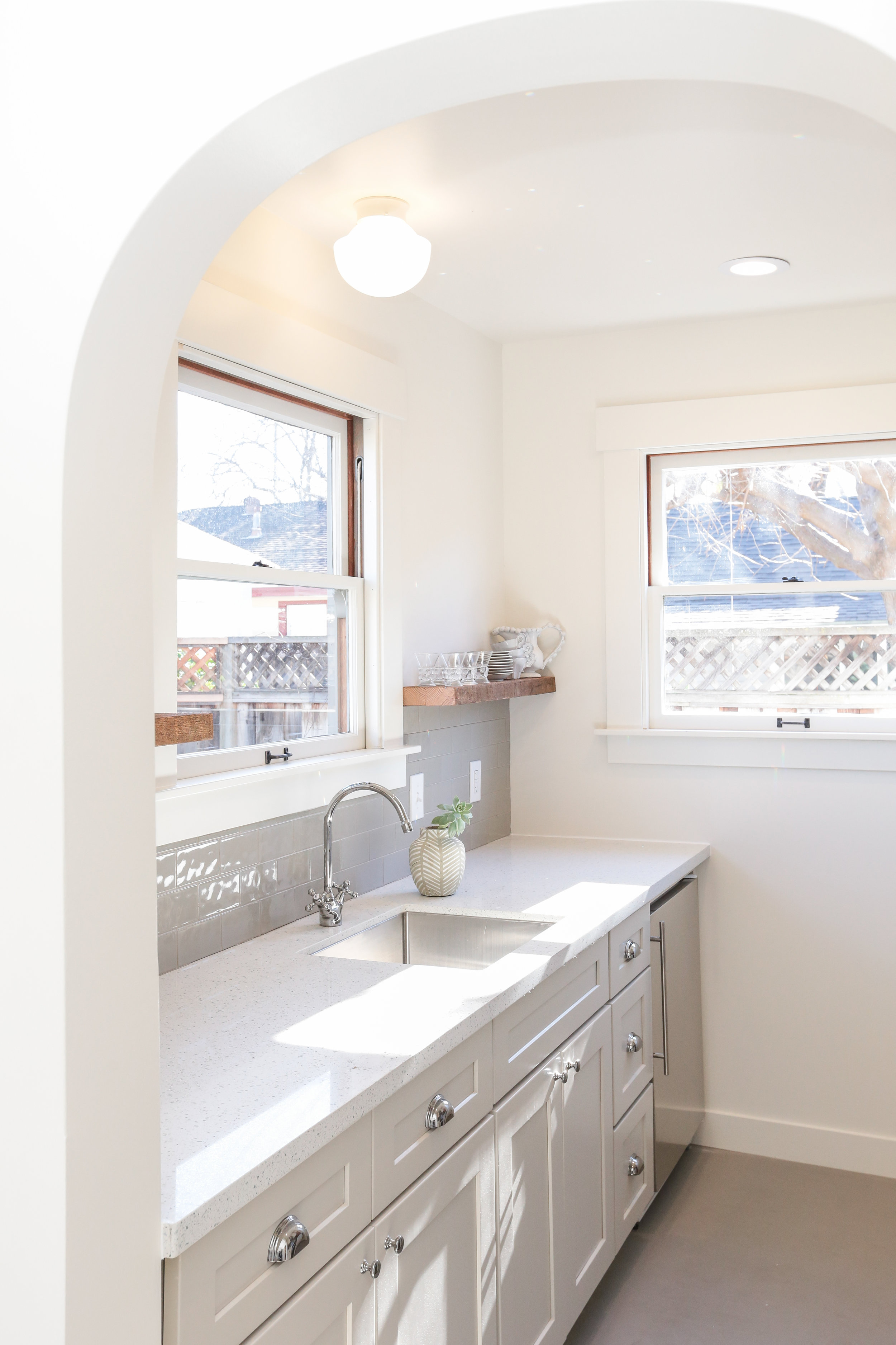
Cottage Kitchen: Walls - BM Dove White in Satin, Trim - Dove White in semi-gloss
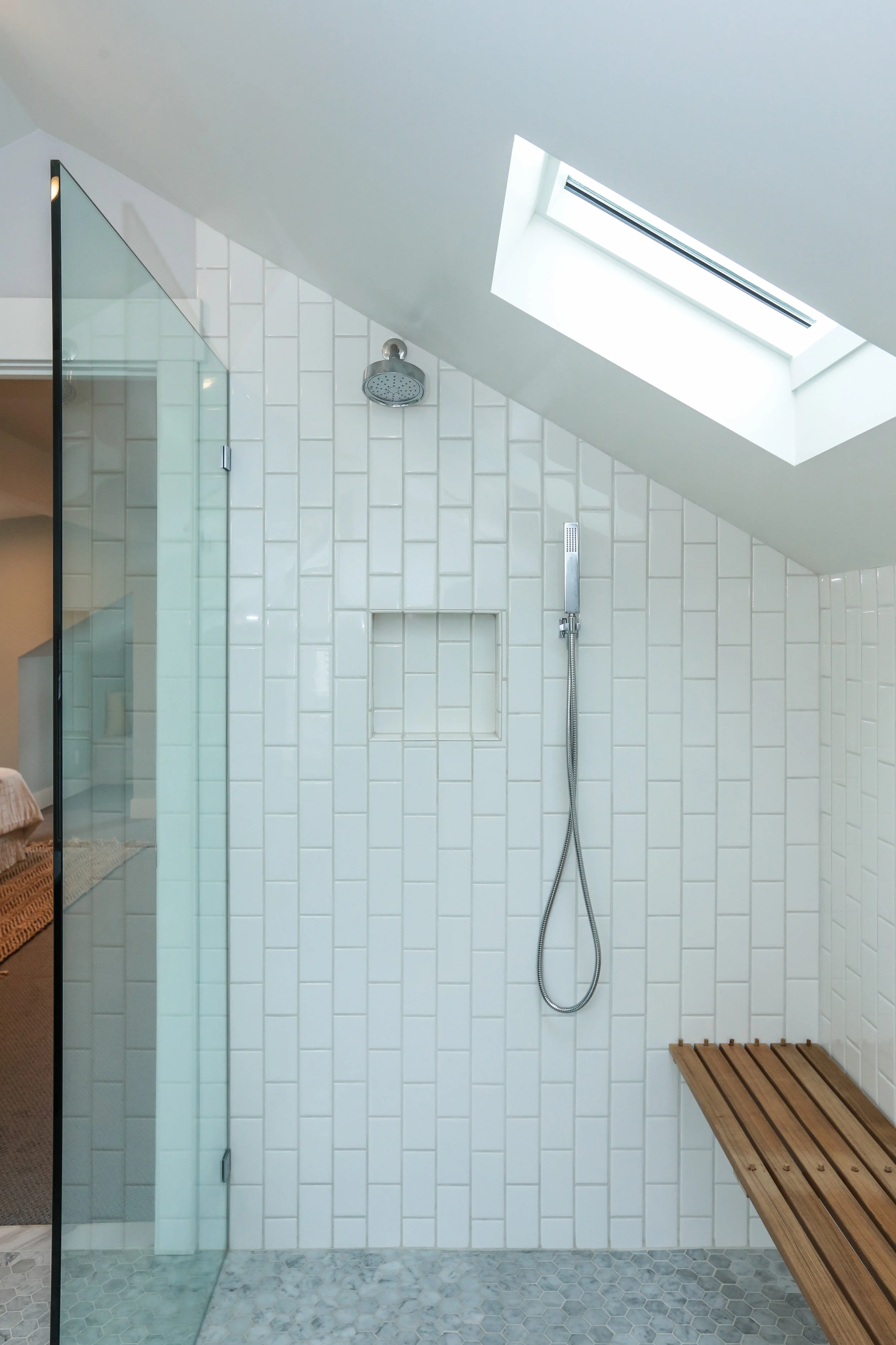
Bathroom: White Dove (satin)
Main house ceiling throughout: White Dove (flat)
Ceiling: White Dove (flat)
Guest Bathroom walls: White Dove (satin)
Thanks for joining us for the Color Breakdown tour. Take a look at other stories below.
And come back soon!
Know anyone who is interested in flipping homes?
WE DOCUMENTED THE RENOVATION OF LINCOLN AVENUE.
TAKE A LOOK AND PLEASE SHARE.
1. Flipping Lincoln Ave: Be brave...begin
2. Flipping Lincoln Ave: Yikes, this place is a mess
3. Flipping Lincoln Ave: Fun with tack strips
4. Flipping LIncoln Ave: Demo Day
5. Flipping Lincoln Ave: Ready Set Go!
6. Flipping Lincoln Ave: Up You Go
7. Flipping Lincoln Ave: We're Deep In Now
8. Flipping Lincoln Ave: Meet Cousin It
9. Flipping Lincoln Ave: It's a numbers game
10.Flipping LIncoln Ave: A long, overdue update
TO SEE THE FULL HOUSE TOUR, CLICK HERE.
OTHER DIY PROJECTS
How to make a Mercury Glass mirror
Create a Criss Cross Vine Wall
How paint transformed my small, ugly bathroom
Add a shower to a small half bathroom
Journey of a Clawfoot Tub
