We are fast approaching the finish line and wanted to share our design vision with you.
Here is our North Star.
This was the render we had done at the beginning of this project. It’s sort of our North Star.
And here’s where we’re at now.
Excuse the cement mixer in the foreground. House has been stucco’d and is ready for paint!
Black front doors have more fun.
Fun Fact: Black doors apparently get $5K more at sale. Seriously. But that’s actually not the reason we are painting the front door black. It’s just a handsome, regal color fit for a house of this caliber. And we thought it was a fun fact. Photo Source
Paint
I’ve made it pretty easy for the painter. We are basically using these 2 colors inside and out!
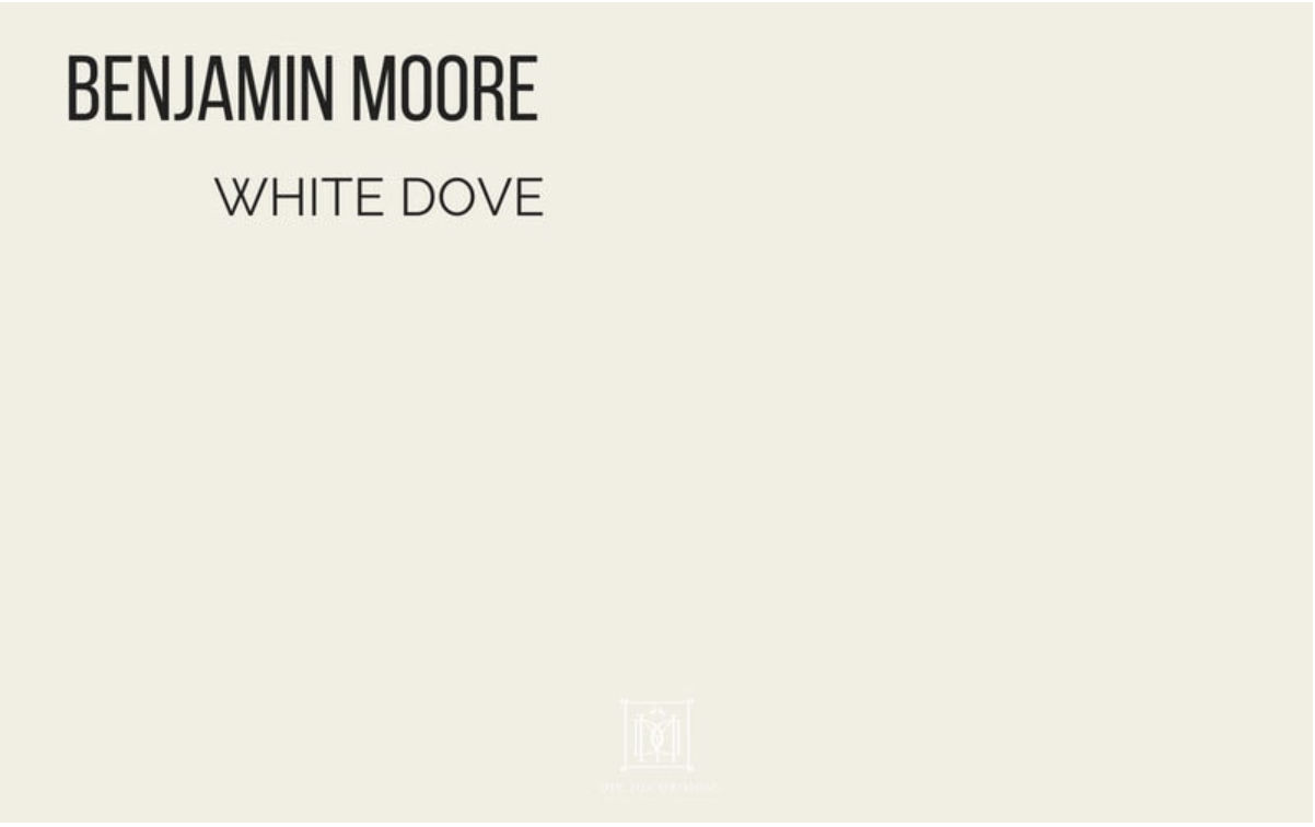
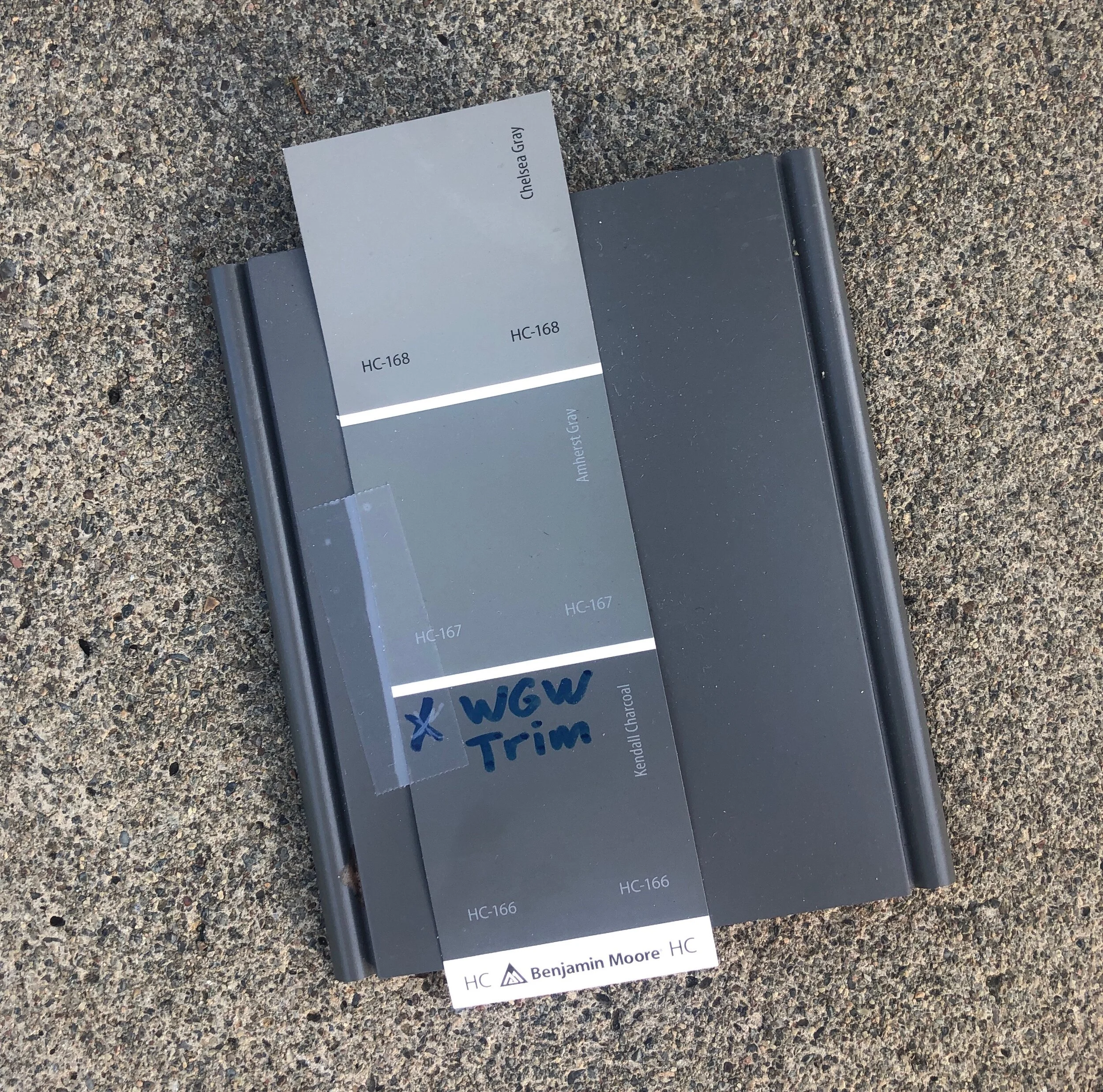
Benjamin Moore (BM) White Dove (the best white EVER!) and BM Kendall Charcoal.
Interior Doors
We thought long and hard about this and finally decided…We are going to paint all the interior doors BM Kendall Charcoal. It is going to be bold and modern but also warm. And someone is going to love it.
Here is another blog we like, with some great, high contrast interior doors. Photo Source
Kitchen
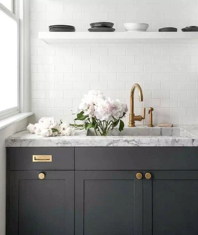
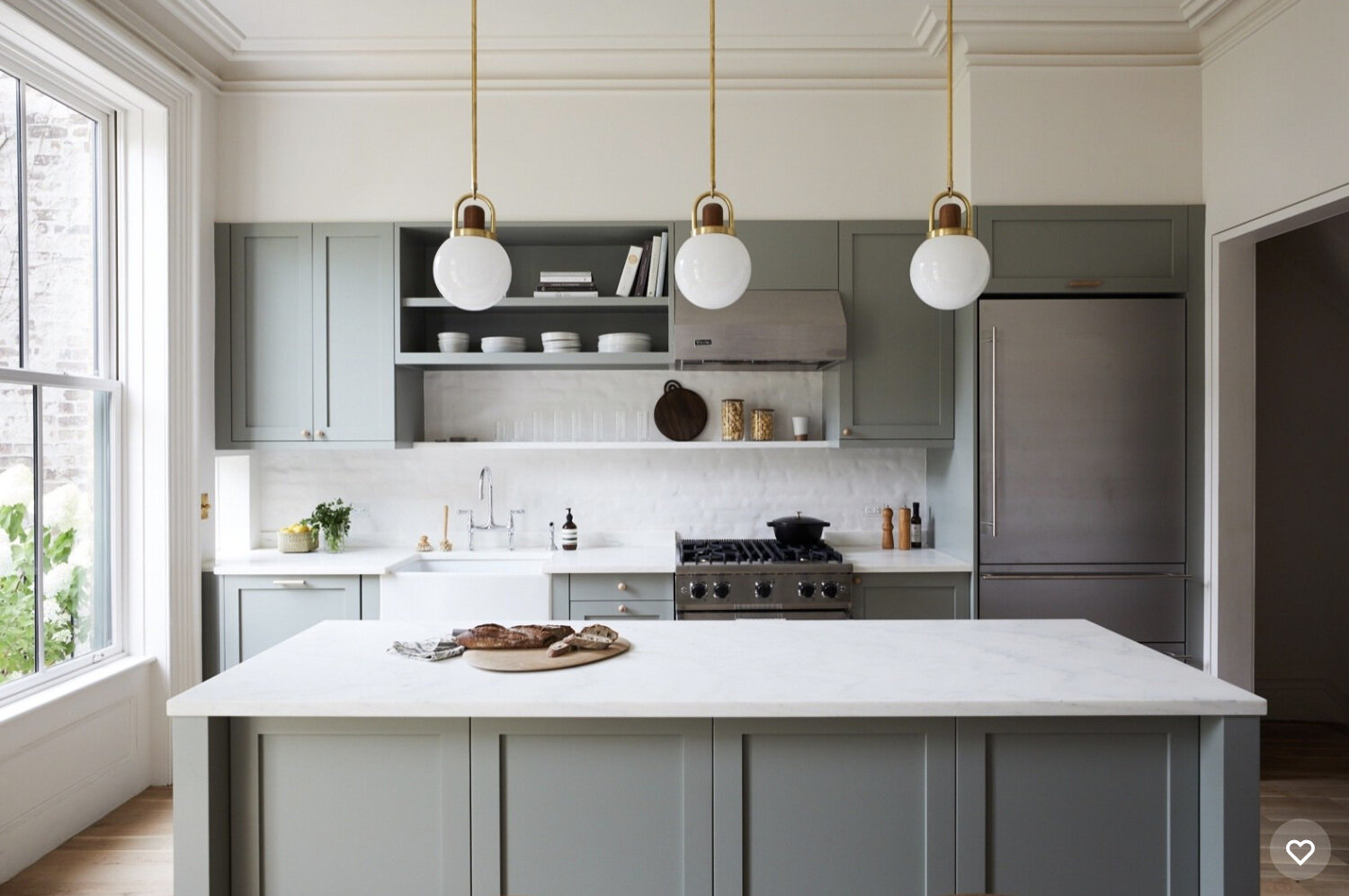
This photo (below) was a source of great inspiration for us, not only the kitchen, but the whole vibe of the house. Love how the brightness of the space is grounded with the warmth of the ceiling and boldness of the dark gray doors and cabinets.
CABINETS
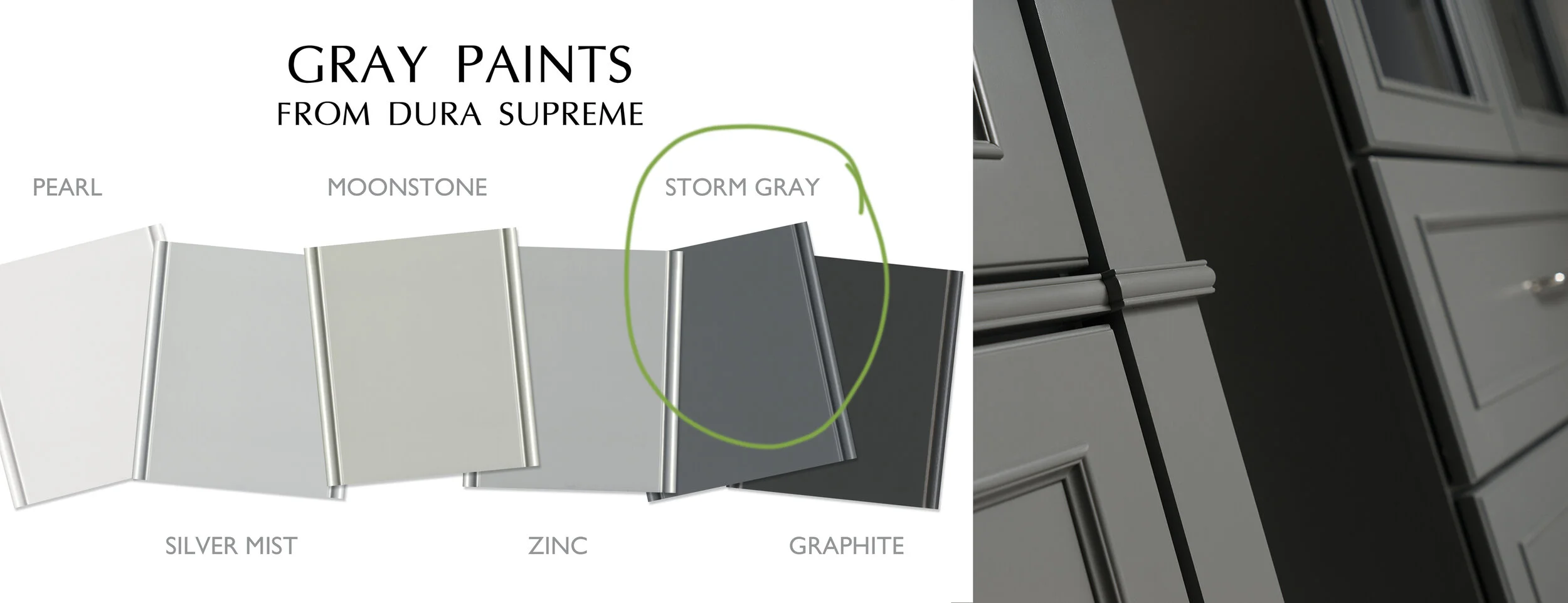
Cabinet Choice: DURA Carson in Storm Gray. Contact Kitchen Designer Extraordinaire, Helena Steele at GGK.
CABINET HARDWARE
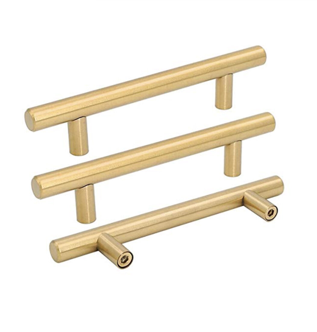
It was a big debate and I finally won. I adore the look of brass hardware. A few years ago, I thought it was just a trend. But now I think it may stick around for awhile. It marries beautifully with the dark gray cabinet color. By the way, the Storm Gray cabinet color is an almost exact match to our exterior trim and interior doors. Will anyone notice? Probably not. But it gives me a warm feeling inside, just the same. Kitchen Pulls: Check them out here.
BACKSPLASH
Recently, we were having a bite at Pizza Antica in Santana Row and we noticed the walls were traditional white 3x6 subway tile. But what made them different was the texture. It wasn’t the typical glossy but rather matte. It was warm and inviting. Traditional and modern, all at the same time. We had to special order, but, what the heck. You can get it here.
Lighting
KITCHEN
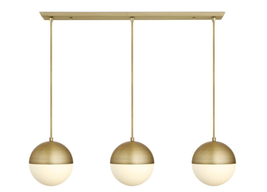
Loved this frosted globe tryptic. It’s going to pull everything together in the kitchen. Here’s where you can find it.
DINING
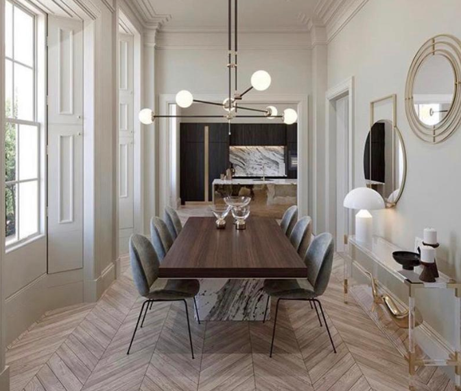
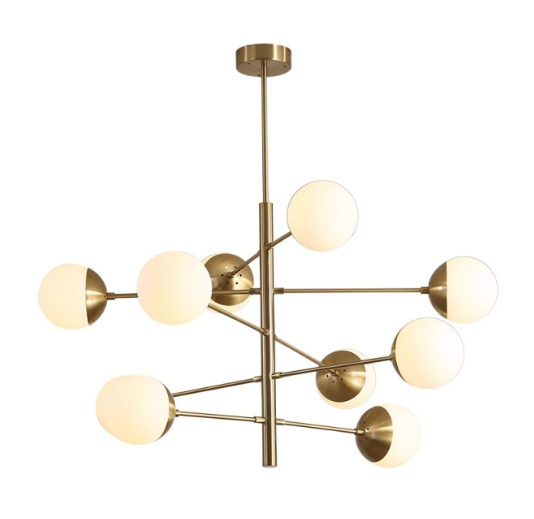
I am totally obsessed with this dining room fixture. This one broke the bank a bit. But it’s going to be one of the first things you see when you walk into the space. Check it out on Etsy here.
Bathrooms
KID BATHROOM
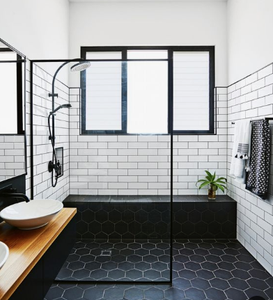
This was the inspiration for our upstairs shared kid’s bathroom. Love the classic simplicity. Also love the delight of the fun, colorful floor.
GUEST (HALF) BATH
UPPER & LOWER MASTER BATHROOMS
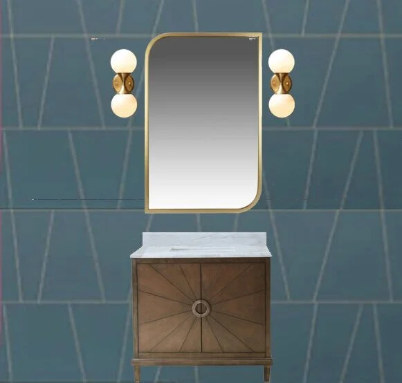
This is sort-of the vibe of the upper master bathroom.
Photo Source
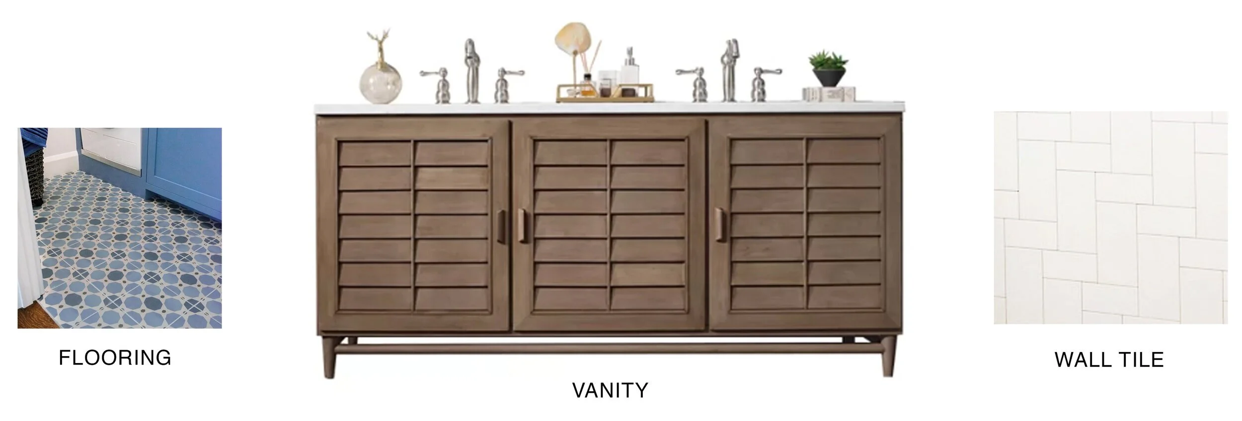
Tile Design
This is the tile guideline I gave our tile guy so he could keep it all straight!
Here is a great article from Emily Henderson where she outlines different pairing options for tile & grout.
LOWER MASTER SUITE, AKA ENTERTAINMENT ROOM
One of the smartest things that Lance insisted on was doing two master suites. “Why on earth would we need that”, I pleaded. He, very rationally, reminded me that people have all kinds of situations. They have older parents that need to move in. They have college graduates that need to move back. Maybe they want to rent a room. Or possibly age in place. Having this second master suite on the first floor allows for many different living scenarios. Plus, it could just be a rad entertainment room,. which is how I plan to stage it.
GRAY ON GRAY
As I mentioned above, while this is technically a master bedroom, we are going to stage it as an entertainment room. I wanted to do something a bit dramatic with the paint job. This room is north-facing so tends to be less bright. I thought we’d lean into this by painting the whole room Charcoal Gray. Not only will this be a great room for watching movies at night but also a super cozy bedroom. Oh, did I forget to mention it has french doors to a private deck with a water feature?
Well folks, that’s it.
I hope you enjoyed the design tour of Willow Glen Way. We plan to have the house staged and ready to view around Halloween and a cocktail party around that same time. So, for you locals, stay tuned.
