Flipping Lincoln Avenue: Starting to visualize. Can you see it?
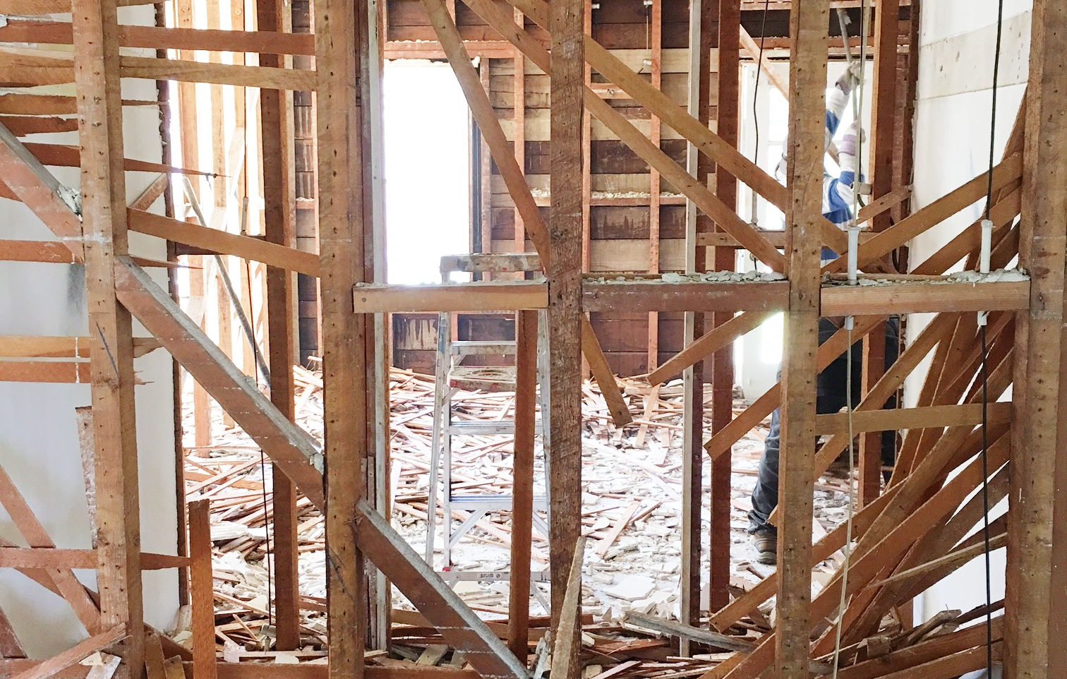
I agree, it looks like hiroshima.
However, we have to look past that and start making decisions about what LIncoln Avenue is actually going to look like on the other side.
This architecture of this house has a real classic, elegant vibe. So, I'd like to carry that into the interior with some rich features. But I also want it to have some soulful, maybe slightly funky features as well. Take a look.
LIVING AREAS
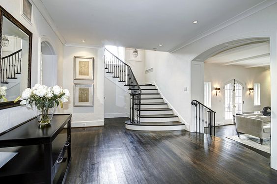
This photo (above) was the inspiration behind the living areas downstairs. I love the simple, modern elegance of the dark floors, lusciously arched walkways and sweeping staircase. In fact, it was the thing that sold me to go up and occupy the attic with a master bedroom. Not to mention that it helps us to gain an enormous amount of square footage. And square footage = value! Now let's see if we can pull it off.
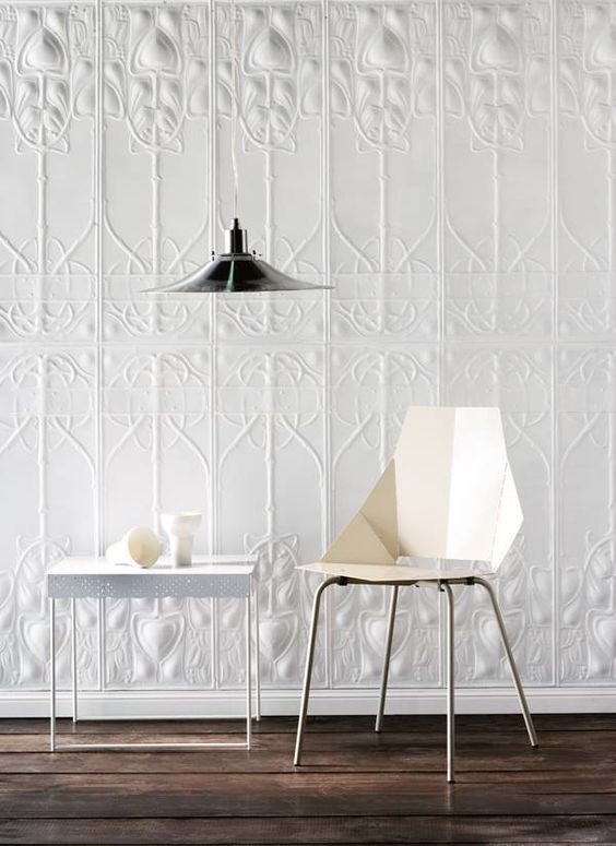
Recently, I was at a restaurant in Boston and was stopped dead in my (slightly hungover) tracks by the design of this place. The restaurant was Stephanie's on Newbury and it had just undergone a massive renovation by Sousa Design. They had this simple, gray wainscoting throughout the whole restaurant. But what really got me was this dimensional, almost pressed-tin wall paper. I was in love.
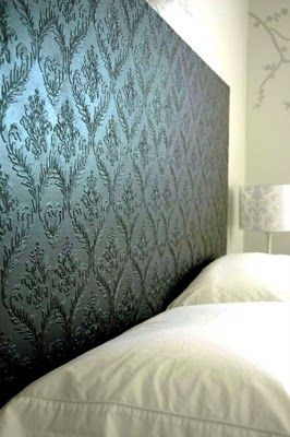
Of course the P.I. part of my brain tracked down the designer in order to spec out the wallpaper. Sadly, I'd need to purchase the amount to line a football field. So, plan B. Lucky for me I found this paintable wallpaper from Graham & Brown. Here are some examples below.
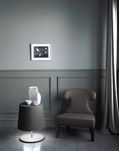
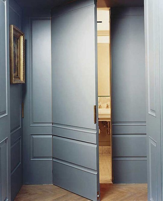
I am imagining the main rooms of the first floor in gray wainscoting throughout. I just can't get over this gray over gray combo (left). Its just dreamy. And, my newest obsession - the invisible door! How cool is that?
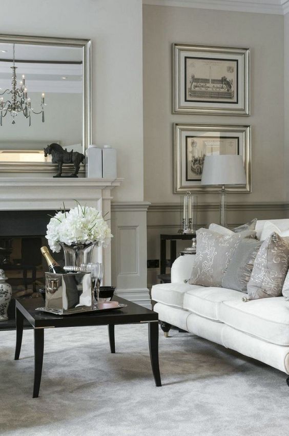
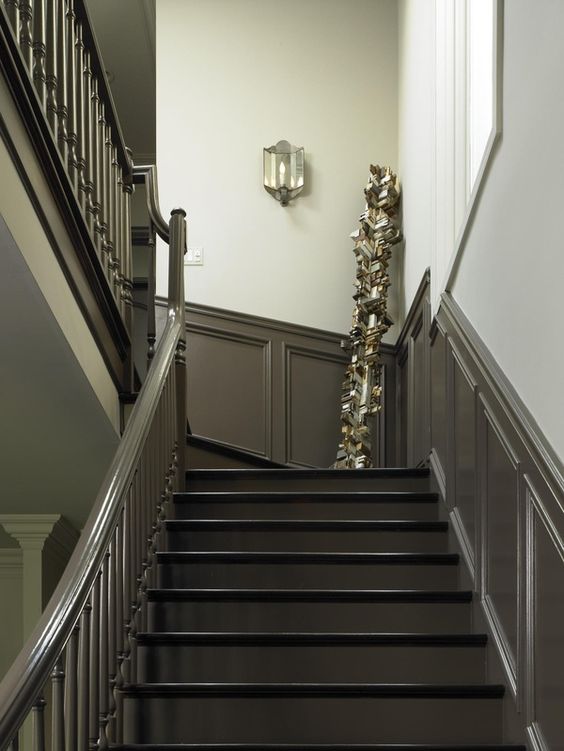
I just adore this tow-toned gray wall (left). The article I found this in was about mirrors but the colors caught my eye. I also really like more dramatic gray wainscoting going up the stairs.
KITCHEN
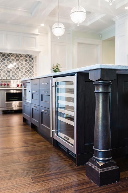
If I had to pick one image that would sum up my vision for Lincoln, it would be this kitchen featured in DecorPad from Sarah Gallop Designs. I reached out to them to find that gorgeous tile above the stove. Turns out its Ann Sacks. It's not in my house flipping budget unfortunately. But a girl can dream right?
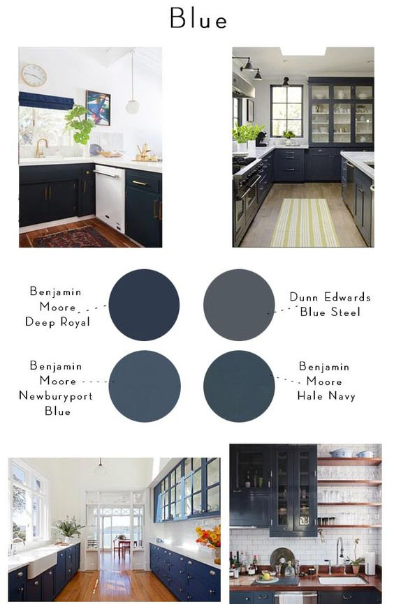
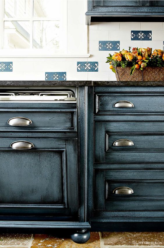
So I am envisioning white or light gray cabinets and counter with a Navy Blue island. Check out the finish on this cabinet below. Amazing right?
Here are some of the color schemes I am planning for and a great article on non-all-white kitchens.
Check out this beauty! It's Benjamin Moore Mozart Blue 1665 with a black glaze. Not sure how this was accomplished but it almost looks like they did a hand-rubbed stain over the top of it. And look at the dishwasher in disguise! Super cool. Check out more shots of these cabinets here.
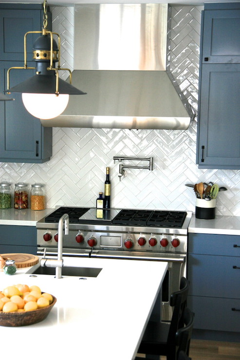
I'm sort of loving this subway tile done in a herringbone pattern, shown by DecorPad.
GUEST BATHROOM
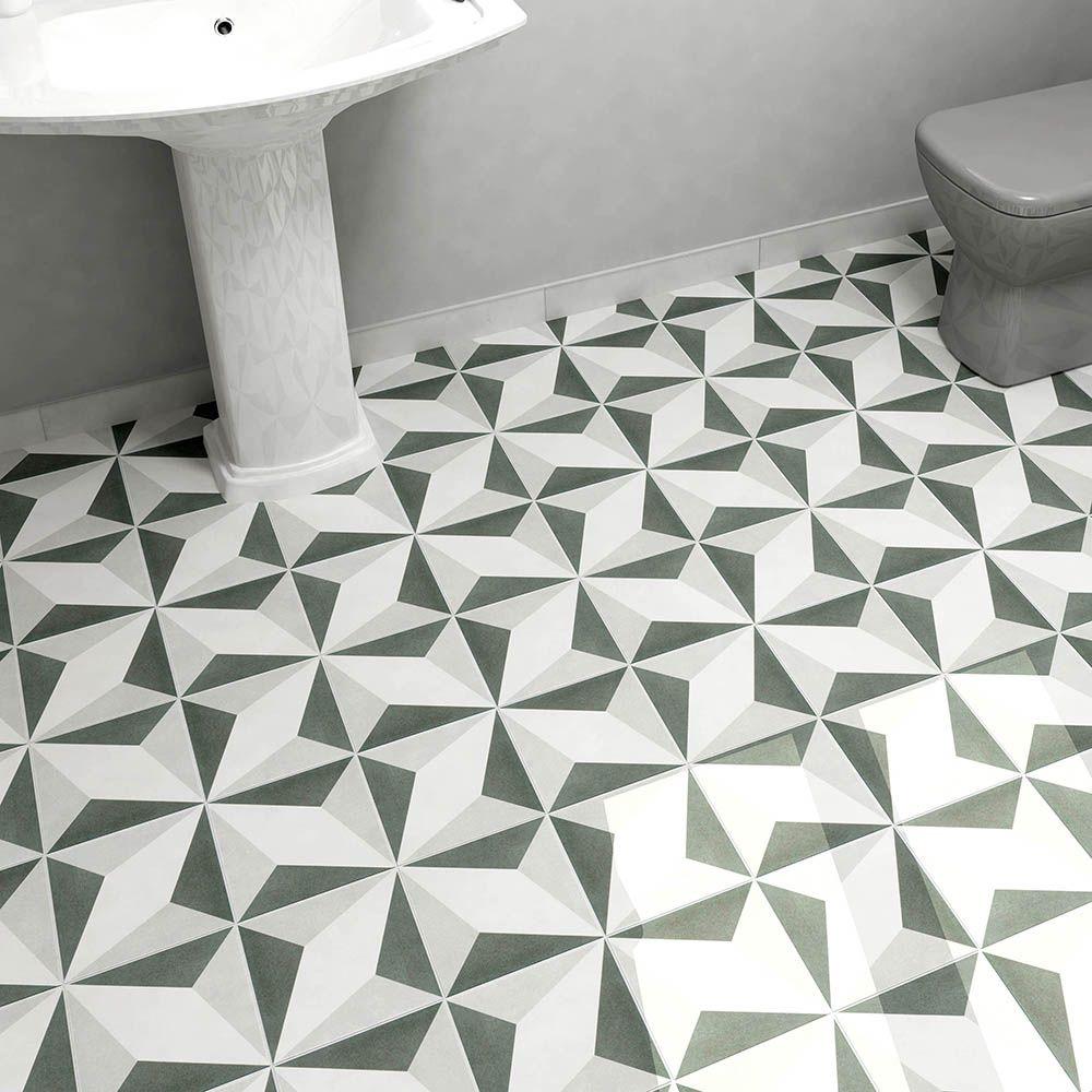
I had great luck with Encaustic(like) tile on Elm Street, so I am going to try it again. Why not, right? I fell in love with the look of encaustic tile but it was super expense not to mention the huge line item for shipping (its heavy). So, I did a LOT of digging to find one in my price range and I'll let you in on my little secret here. I like the idea of a simple, classic bathroom and then having the floor pop! Take a look at this great article from Apartment Therapy with some stunning bathroom ideas.
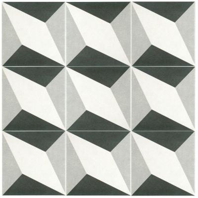
Here's the tile I chose for the guest bathroom. It's Merola Tile. And it was just delivered. I could do either pattern. Which do you prefer??? Please comment below.
NUMBERS NUMBERS NUMBERS
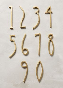
Would you look at these numbers from Anthropologie. I sort of can't stand it.
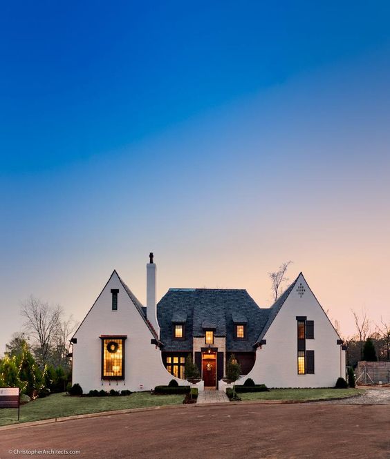
I am going to leave you with this most inspirational, ridiculously stunning Tudor home. Not that Lincoln will be anything close but this guy given us something really amazing to shoot for!
HELP ME OUT, PEOPLE.
Please leave comments and let me know what you want to see more or less of. Or just swear at me.
AND MAKE SURE YOU DON'T MISS ANY OF THE PROCESS ON LINCOLN AVENUE
1. Flipping Lincoln Ave: Be brave...begin
2. Flipping Lincoln Ave: Yikes, this place is a mess
3. Flipping Lincoln Ave: Fun with tack strips
4. Flipping Lincoln Ave: Demo Day
Lastly, if you find this the slightest bit interesting, please share and ask your friends to subscribe. Thank you so much for your support
- Lance and Diane
